|
Showtime Upholstery Market Report:
COLORS AND MOODS IN UPHOLSTERY DESIGN TRENDING TO LIGHTER AND BRIGHTER
Craftex
By Arthur Douglas Thayer
HIGH POINT, NC -- Rugs and upholstery fabrics are strategically alligned product categories, so when color palettes and designs change in upholstery, the rug department will reflect the shift.
This Summer, upholstery styles are lighter and brighter. That was the mood at this Summer's Showtime market held last month in High Point, NC. Showtime is the trade show held twice a year for upholstery fabric introductions from around the world.
Upholstery and rug makers are beginning to work more closely together to produce complementary lines. Fabric maker Elegance recently developed a program with 828 International Trading. In Elegance's fabric showings, each textile was shown with a color coordinated rug.
In addition, Surya's Goa rug collection has been developed with Rowe Furniture to produce cross-category colors and designs.
Hellenic Rugs works closely with Ashley Furniture to insure that colors and patterns are coordinated across rugs, upholstery and other home textiles.
Here are 10 strong directions that we saw in fabric introductions at Showtime:
- Spa blue or the slightly greenish robin's egg blue - the greenish blue.
- Yellow green called variously kiwi, apple or pear.
- The warm colors - orange, red and pink.
- White as a clarifying tone with bright colors.
- Chocolate, alone or with pastels.
- Stripes, especially ombre effects.
- Silks
- Performance fabrics.
- The melding of contemporary and traditional styles.
- The retro looks of Art Nouveau and Arts and Crafts.
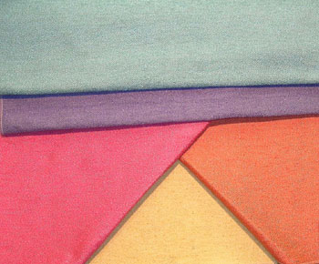
Soothing Blue-Greens
Advantage
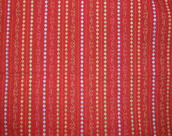
The sequence of trends begins with soothing blue green. Robin's egg is taking hold after several seasons - most commonly seen as solids, in stripes, in trim lines, as accent color, combined with kiwi and chocolate.
Circa 1801 Curve
The currently popular, warm luminous green, kiwi or apple works well with spa colors. The green works equally well with rose.
In jacquards, the same green blends beautifully with lemon and terra cotta.
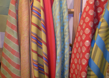
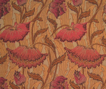
Warm and Bright
Portfolio Nevis
Warm colors tended to be bright as well as warm. The shade of choice was orange especially mixed with other warm shades, but clear red was also a factor.
Wearbest Lasso
Pink , called coral, tomato and salmon (a more masculine pink) ratcheted up the intensity. And orange and pink together looked new and fresh.
Portfolio Vibe
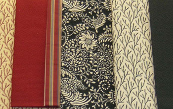
White, Black and Chocolate
White and off-white are perfect foils for pretty and bright colors, especially in prints.
Tietex Patio Collection
Look for black and white to become extremely popular reflecting the strong influence of apparel on home furnishings.
Circa 1810 Shades of the Orient
Chocolate continues as the strong new alternative for black, chiefly in solid form and backgrounds
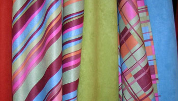
Stripes
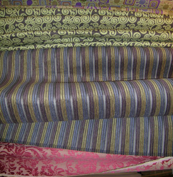
S. Harris Fabricut
Stripes are always around. This season, they are featured as pillow fabrics. Some are very textured with chenilles and boucles and there are several outstanding looks in ombre and mirrored effects.
Silk: the Hot Luxury Fiber

Nipkow & Kobelt silks
In the high end, and as accent textiles, silk was the hottest luxury fiber. Most came from China and India.
Kapra embroidered Indian silk
High Performance Fabrics
While delicate silks were directional, so were high- performance fabrics, constructed from ultra-cleanable and superdurable synthetic fibers.
Wearbest Bella Dura
Ultasuede and all the micro-denier polyesters were especially prevalent. High end mills like Wearbest are now getting into the high performance fray.
Contemporary and Traditional Meld Together
Valdese Faircloth
In this very mixed and multi-cultural market, influences collide, mix and influence each other. The seemingly opposed trends of contemporary and traditional are doing just that. In fabric it means traditional pattern motifs in casual, lifestyle colorations and textures.
Traditional becomes less formal and contemporary looses its harsh, spare feeling.
Historical References
Home fashion has cycled through the Raymond Loewy/Industrial design era and 50's-60's-70's kitschy madness, followed by the elegant ultra-decorative Art Deco.
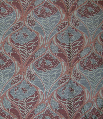
Valdese Art Nouveau
The next historical craze on the horizon blends the Art Nouveau and Arts and Crafts movements.
It is quite ironic to realize that Art Nouveau's founding precept was a denial of historical precedence, no referring back to any previous periods for motifs, colors or inspiration. So Stickley Furniture won't be the only manufacturer in October showing retro textiles from these periods.
Craftex Flanagan
ED NOTE: Contributing editor Arthur Douglas Thayer is a designer, photographer and writer based in Atlanta. He specializes in furnishings and home textiles.
8.10.05 |