NEW YORK -- Instilling calm, confidence and connection, Pantone's 2020 Color of the Year, 19-4052 Classic Blue, highlights a desire for a dependable and stable foundation on which to build as we cross the threshold into a new era.
A timeless and enduring blue hue, Pantone 19-4052 Classic Blue is elegant in its simplicity. Suggestive of the sky at dusk, the reassuring qualities of the thought-provoking Pantone 19-4052 Classic Blue highlight our desire for a dependable and stable foundation on which to build as we cross the threshold into a new era.
Imprinted in our psyches as a restful color, Pantone 19-4052 Classic Blue brings a sense of peace and tranquility to the human spirit, offering refuge. Aiding concentration and bringing laser like clarity, Pantone 19-4052 Classic Blue re-centers our thoughts. A reflective blue tone, Classic Blue fosters resilience.
As technology continues to race ahead of the human ability to process it all, it is easy to understand why we gravitate to colors that are honest and offer the promise of protection. Non-aggressive and easily relatable, the trusted Pantone 19-4052 Classic Blue lends itself to relaxed interaction. Associated with the return of another day, this universal favorite is comfortably embraced.
HOW TO USE THE PANTONE COLOR OF THE YEAR 2020
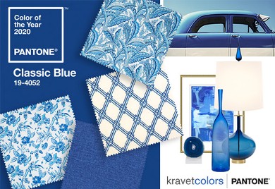
Kravet, a Pantone partner for 2020, showcases the cross-coordinated decor possibilities of Classic Blue.
Five unique color palettes featuring Pantone 19-4052 Classic Blue help bring this year's special shade into interior designs. Each palette conveys a different mood, illustrating the versatility of Classic Blue, and is supported by three suggested color combinations:
PONDER
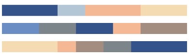
Surrounded by a palette of cool blues and an array of warm and soothing shades, thoughtful and meditative Pantone 19-4052 Classic Blue helps induce a gently calming effect and feelings of peaceful tranquility to the human spirit.
SNORKEL
Evocative of a bliss-filled tropical paradise, the enchanting color story in Snorkel transports us to an idyllic destination. The addition of a classic black and white creates a dramatic contrast with the depth and strength of Pantone 19-4052 Classic Blue, providing the anchoring foundation.
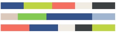
DESERT TWILIGHT
Suggestive of the early evening sky, the boundless Pantone Classic Blue 19-4052 creates an elegant backdrop for a glittery grouping of sophisticated shades painted across the sky, adding illuminating sparkle to a Desert Twilight.
EXOTIC TASTES
An intriguing and adventurous potpourri of tastes and colors reflective of natural seasonings, condiments and blue foods. Foods in blue similar to Pantone 19-4052 Classic Blue are rich in anthocyanins, and with their relationship to wellness and self-care, help to build a solid foundation, acting as a form of protection for good health.
UNTRADITIONAL
Nothing says untraditional better than an unusual and unexpected palette of colors. Standing at the helm is Pantone 19-4052 Classic Blue, a foundational shade that sets the stage for unique combinations and fun color mixes, as well as other outrageous and surprisingly shimmery fashion statements.
PANTONE PARTNERS
Among its partners this year are Adobe Stock, Fed-EX, and Kravet, an industry leader in to-the-trade home furnishings. In a statement Kravet said it is proud to partner with Pantone to bring the Color of the Year 2020 selection, Pantone 19-4052 Classic Blue, to life for the interior design community. In celebration of the announcement, Kravet presents fabrics inspired by the timeless and enduring blue hue, as well as decorative accessories that invoke the reassuring qualities of the thought provoking color.
About Pantone Color of the Year
For over 20 years, Pantone's Color of the Year has influenced product development and purchasing decisions in multiple industries, including fashion, home furnishings, and industrial design, as well as product packaging and graphic design.
The Pantone Color of the Year selection process requires thoughtful consideration and trend analysis. To arrive at the selection each year, Pantone's color experts at the Pantone Color Institute comb the world looking for new color influences. This can include the entertainment industry and films in production, traveling art collections and new artists, fashion, all areas of design, popular travel destinations, as well as new lifestyles, playstyles, and socio-economic conditions. Influences may also stem from new technologies, materials, textures, and effects that impact color, relevant social media platforms and even upcoming sporting events that capture worldwide attention.
About The Pantone Color Institute
The Pantone Color Institute is the business unit within Pantone that highlights the top seasonal runway colors, selects the Pantone Color of the Year, forecasts global color trends, and advises companies on color for product and brand visual identity. Through seasonal trend forecasts, color psychology, and color consulting, the Pantone Color Institute partners with global brands to effectively leverage the power, psychology, and emotion of color in their design strategy.